Friday, April 27, 2012

Round accordion journal - This Is Me 2012

Hi there! It's 6pm and I'm already home from work. Oh wow!! I had to leave office early today to collect my car from the service centre. Feels great to come home when the sun is still up and the traffic isn't so bad.

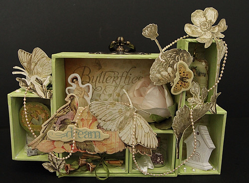
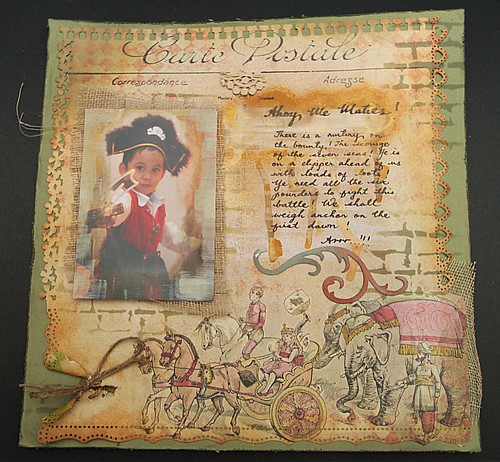
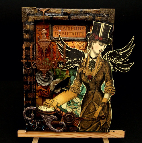
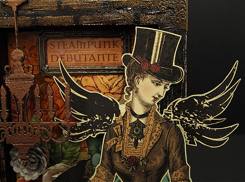
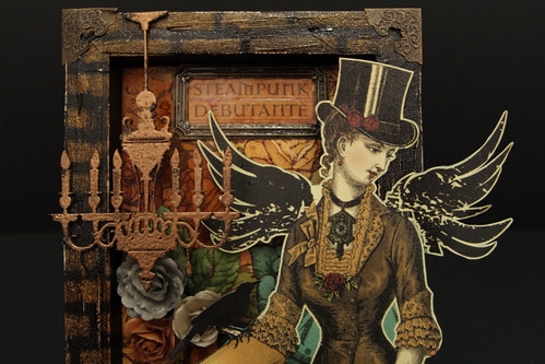
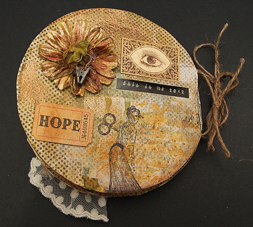
Anyway, here is a round accordion journal that I did few weeks ago. I didn't really want to blog about it cos I think its quite disastrous...lol! Anyway, since there is no right or wrong in art; I decided to blog about it anyway. Ok, let's walk through the making of this journal...

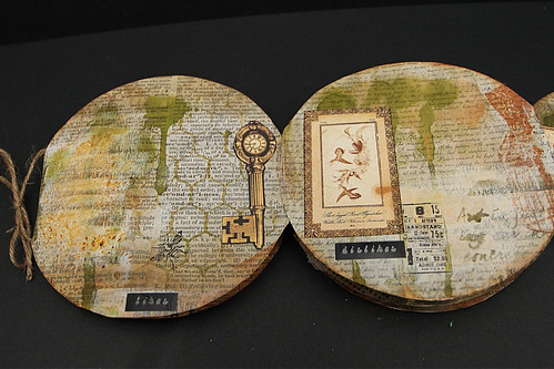
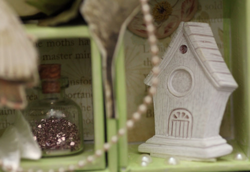
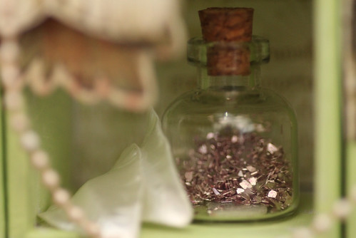
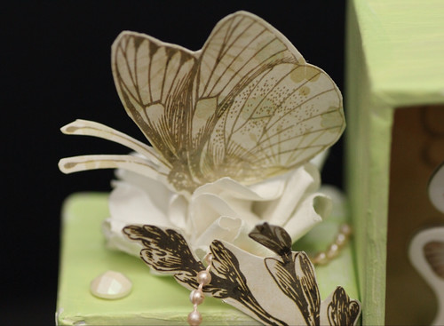
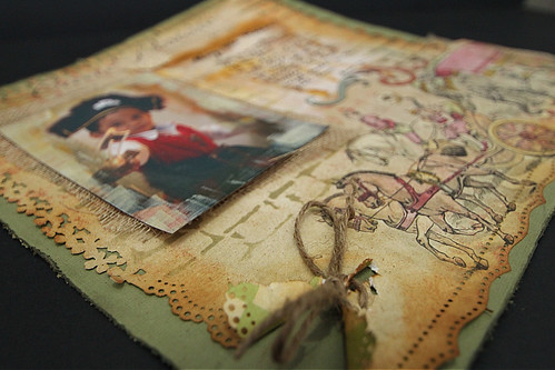
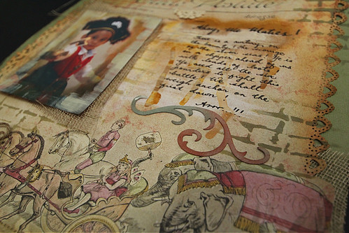
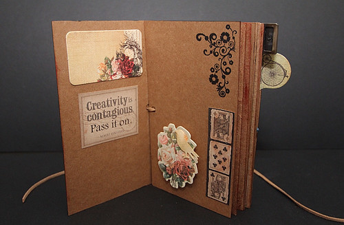
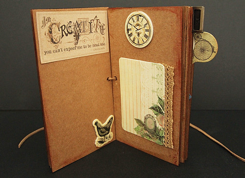
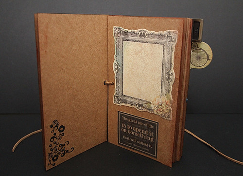
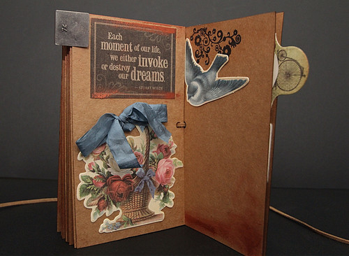
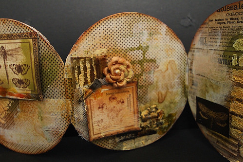
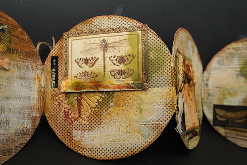
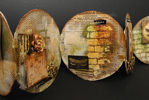
I have used a round accordion journal made of Kraft paper and I can't remember who the manufacturer is. My bad. Comes with a round metal canister to store. Pretty neat. I have layered a Bazzil Basics pp onto each round panel and distress with Ranger's Distress inks. Next, spray, spray, spray, spray, spray....with Tattered Angels and Colour Wash by Ranger. I've basically soaked the whole journal in them. Oh yeah...and I did splashed gesso over several pages...Oh yeah, and a bit of Viva Decor over the edges, flowers, etc.

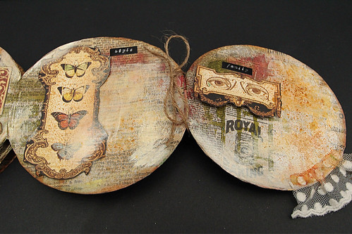
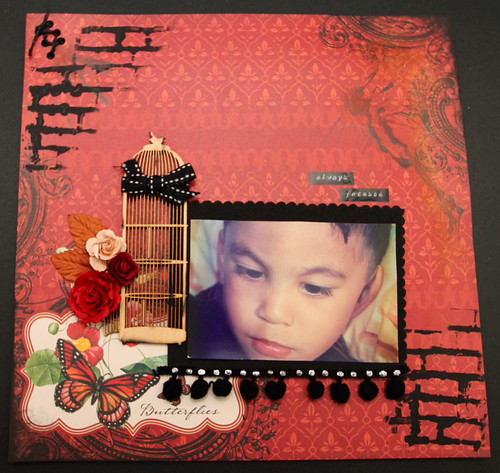
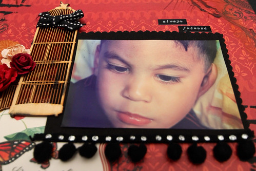
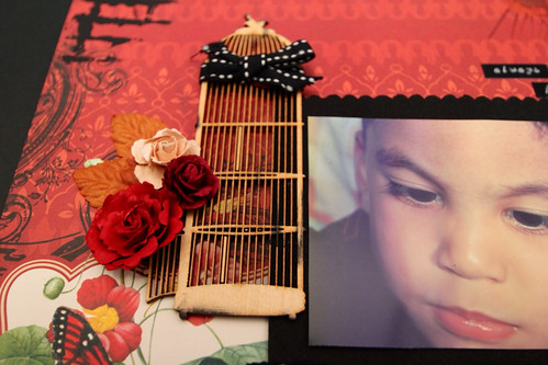
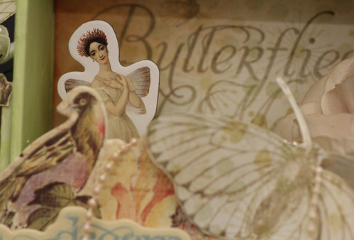
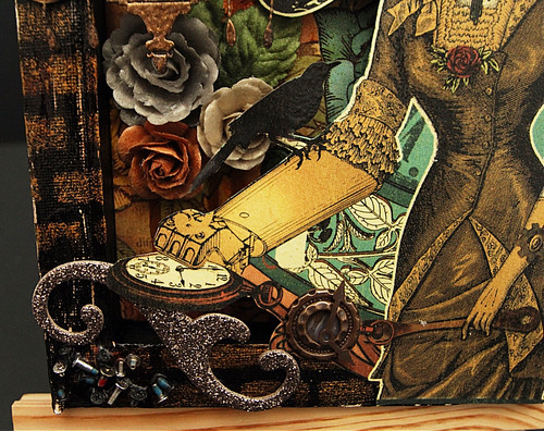
And, here, below, I have used Martha Stewart White Texture to create on the brick and butterfly stencils by The Crafter's Workshop.

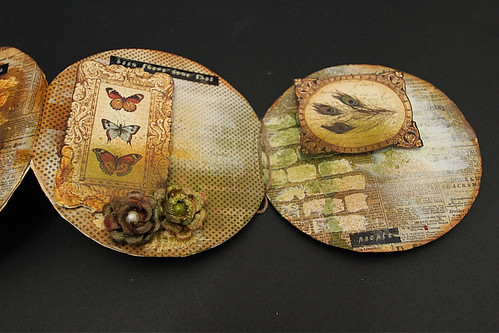
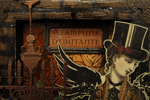
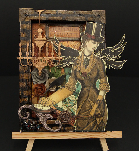
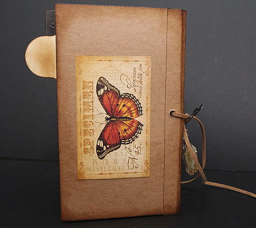
Another pp that I have used here is from Graphic 45.

Above, I have used corrugated cardboard, splashed it with white texture paint and spray again with Colour Wash and layered with a tulle netting and a paper embellie ( G45); secured with a trinket pin by Tim Holtz. Can you see a small cluster next to it? Well, they are actually tiny screws and washers that I have glued with Glossy Accents and ...spray..spray..spray...spray...


That's the stencil of a butterfly using white texture paint by Martha Stewart. Then I spray, spray, spray....

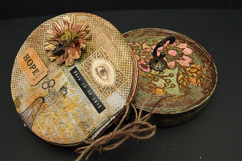
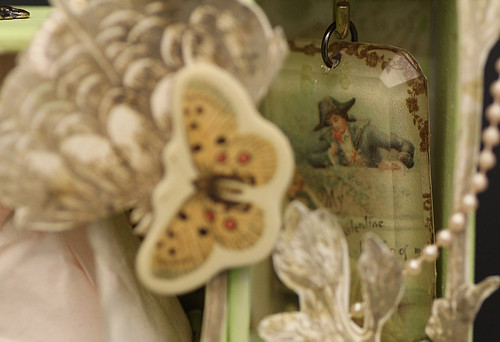
Ahhh yess... So there it is above, the metal round canister to store the journal. I applied Ranger's alcohol inks onto the surface and when dried, I applied the Martha Stweart white texture on Prima's flower motifs stencil on the cover. When dried, I applied distress inks onto the flower images with distress inks. Lastly, add the metal handle to the cover-bought that from Nagoya Textiles when my mother went shopping for her curtains!

Thanks for stopping by! Ciao!

Materials used:

Pp: Bazzil Basics, Graphic 45

Trinket pin: Tim Holtz Ideology

Metal clip: 7Gypsies

Flowers: Prima

Screws and washers: Low Yat Plaza... Lol!

Stamp: Graphic 45 & Tim Holtz

Adage ticket: Tim Holtz

Stencils: Prima and The Crafter's Workshop

Inks: Tattered Angels, Colour Wash by Ranger, Gesso, Viva Decor, Distress inks by Ranger


Wednesday, April 25, 2012

Always Focused - a scrapbook layout for The Color Room #107


Hi! It has been awhile since i last played in TCR. I've been itching to participate but was always busy doing something else. This week's colour is so lovely and I love it, hence I decided to give it a try.

So, for TCR#107, here is a new layout from me 'Always Focused'.

Nothing extraordinary in this layout (except for my darling son, of course!) Hehe... Pretty simple stuffs.

I love to paint and getting my hands dirty so there it is; the brick stenciling using black gesso..lol!


Thanks for stopping by and have a nice day!

Materials used:

Patterned paper: DCWV

Wooden chipboard: Kaisercraft

Flowers: Prima

Stencil: The Crafter's Workshop

Dimensional pearls: Ranger


Tuesday, April 24, 2012

Shabby chic 'nesting' box

Hi there! Today, I want to share a project using the Tim Holtz Configuration Box, which has been altered into a shabby chic nesting box. Nesting. Emm.. Well, I call it 'nesting' since I can stuff things inside them. Lol! Its just my own definition...

This project is for Scrapbook Memories (SM) and it will be displayed in the store soon. I have been getting my supplies from SM since many years back; probably the time I started to do glass paintings. That time, they had different name but the same company origin. Over the years, I think that customer - supplier relationship has grown to become good friends. I like it that they always have something new to explore at the shop and that they are always friendly enough to exchange ideas or to demonstrate new techniques on the spur of the moment. Excellent. And they give good discount too.

This configuration box was given to me by SM and they have asked me to come up with well...anything at all. It took me quite some time to decide what I wanted to make out of it. I have never worked on Tim Holtz's Config box before.

I took 3 boxes out and glued them on the sides; well after I have painted them firstly with gesso and then with Martha Stewart paint in pastel green. Only then did i realised that I'll be working on a shabby chic's theme. I have layered the base of all boxes with patterned paper by DCWV- Mariposa and purposely chose the theme of the paper, which is Butterflies and Moths to be in the main box.

I have inserted a light pink rose ( balance from my wedding; few years back..hehe) in the main box and it settled quite nicely in it. Lol! I have added a chipboard of a ballerina girl (but with wings!) and secured onto the base. Looks as if she's standing quite independently on her own ...(using a double-sided tape!). I have also fussy cuts the flowers and butterflies from the same pp and glued on the edges.

( now that I got the hang out of my macro lens, below are few macro shots-still exploring!)

Above is the shabby chic resin bird house by Prima and an apothecary bottle filled with mica flakes.


A trinket pin and accoutrements by Tim Holtz Ideology.

A butterfly on Prima white flower.

Above is a chipboard sticker, which I have layered with cardbox and it's actually quite springy!

I have also used Tim Holtz's Facets, and glued onto it a die cut image from Kaisercraft. I have used a hook, which was screwed to the top of the box and later hung the facet when dried.

Last but not least, I have added an antique looking wardrobe handle onto the top of the main box. A handle so that it can be carried anywhere you like...

Thanks for stopping by and have a nice day ahead! Ciao!

Materials used:

Patterned paper: DCWV - Mariposa

Chipboard stickers: Prima and Kaisercraft

Die-cuts: Kaisercraft

Shabby chic resin bird house: Prima

Facet, accoutrements and trinket pin: Tim Holtz Ideology

Paint: Martha Stewart

Flowers: Prima, my own collection and one from D'Nata

Pearls: Queen and Co

Crystals: Prima


Monday, April 23, 2012

The Art of Lego - making of a Death Star


I guess to all the Star Wars fan out there, Death Star is nothing new. I have been a fan since schooling days starting with Star Wars, Empire Strikes Back and of course Return of the Jedi. Then came long Phantom Menance, Attack of the Clones and Revenge of the Sith. Who doesn't know Darth Vader ? Luke Skywalker. Or even the cute R2D2 and C3PO?

When I first introduced Star Wars to my son; I think he was simply awestruck with the characters. In a very short time, he remembers who's who. At around that particular time, I have been having a hard time convincing him on potty training. He simply refused to let it go in the toilet. Not until.......one day I came back from the bookshop and brought along with me the Lego Visual Encyclopedia of Star Wars.

The moment he sets his eyes on Death Star Lego, he then asked me; while sitting on my lap, " Mommy, if I use the toilet next time to pass motion, will you buy me this?" -( his exact words were a lil' bit simpler, of course.. Lol!). And I said YES! Of course I will! In a flash, he jumped out of my lap, ran into the toilet upstairs and voila! Now, wouldn't you want to keep a promise like that??

So, after a couple of months, we came across the real Death Star at Brickboys toys at Tropicana Mall but they were already sold out and we were told that Death Star is now discontinued from production. Frustrated, we looked up on eBay and found that we can actually buy it from there...but hey..imagine how much it would be + transport! It contains 3,803 of Lego pieces and I can imagine how heavy it is. Alright, let's go to Legoland then; but it's only due to open in September. We promised him then that we will be getting Death Star for his birthday ( not knowing how..). Owhh...We even thought of vacationing to LA this year just to get this! Lol!

So, Death Star was almost forgotten (just embedded somewhere dormant in the brain!) until one day he decided to just peep into Brickboys toys and wooohoooo...guess what we saw?! A brand new Death Star in a box for sale! He was excited and begging ...and guess what....mommy did the same too!! Hehehe...guilty.... I couldn't really tell who was actually even more excited to see it!

So, we brought it home with us and started fixing things up on a fine Saturday at 11am. That was the time the first packet was officially opened and we timed ourselves. Now, my son didn't really get into the 'making'. It was me and my Mom! Yes, my mom did all the help in sorting the lego pieces by shapes and it was me who patiently put all the pieces together and 3,803 of them!!! Err.. Mom did piece up few loose components, actually, but she left it to me to fix them all in place on the Death Star. Call me crazy, but to me, it was tremendous fun! Roughly, it took us 16 hours to complete.

So, I have taken few photos here; in fact, I have taken well over 300 pictures in documenting the journey of building up the lego Death Star. Few of the photos were taken on macro shots. Like the one above of the famous Darth Vader! Love him!

I love doing this and able to share the fun with him. Now, Death Star is sitting nicely in the dining room, on my Mom's dining table; for the time being of course. Now, she has already given me the 'signal' for it to be removed ASAP and next is going to be another headache to find a suitable place for it in the house; which is already laden with enough toys around!

Thanks for stopping by!


Tuesday, April 17, 2012

Ahoy Me Maties!! Arrr.... - a scrapbook layout for Papier


Hola! I'm back again with a new 12x12 layout. I like it how a layout is able to tell you a story by adding a bit of journalling that goes with the photo. I have used a calligraphy pen for the journalling and so here it is, presenting a letter from a pirate to his fellow mates for yet another battleship! Arrrrrr..... Hehehe!

As you can see, I have used quite a number of Martha Stewart as well as EK's punches on this layout..hehe...I have used The Crafter's Workshop stencil as well; sprayed the Ranger's Colour Wash through it and later stick back the side which was wet onto the layout- that means you won't be wasting your ink :))

This layout is about the pirate calling out to his mates for another battleship, and it is done by writing on what supposedly be a piece of 'parchment'. The paper I have used here, which if from my April DT kit; has a 'Carte Postale' and other words like correspondence and addressee on it; thus making it suitable for this layout title. Most of the materials used here are available at Papier.

Till then, see you next time and thanks for stopping by!

materials used:

Ink: Distress ink and Colourwash by Ranger

Grungeboard paper: Tim Holtz

Punches: Martha Stewart and EK


Saturday, April 7, 2012

Steampunk Debutante - a tribute to me!


Hola! Today, I want to share with you on a little piece of me ;)))
This altered art was created with 'me' in mind. What I love best, what I do now and what I wish I can do.

What I love best, ( I mean of course besides my loving family!) is able to craft and use it as my own personal stress-relief, detoxification (too much maybe!) therapy.

What I do now, well, it's definitely 'steampunk'! I deal with steam in my job. Saturated and superheated kind! Hahaha..... What I do at work, I need to know how steam behaves so that it does work in my turbine and gives out electricity....using a sustainable fuel. So, steampunk? Ok...I'll take that anytime...hehehe

What I wish I can do? Hmm.... I wish I can fly. Not with wings flapping behind me like this lady but more like to fly an aeroplane. Being the only child, you don't get the luxury of being too crazy, intolerably adventurous. So instead, I only went as high..whoops...not so high as mountaineering and as loooowww as scuba diving....( what I mean is instead of going up, my parents were OK on me going down! Hehe..... After much persuasion of course...and up to a point where I took them with me to show how 'dangerously' safe my hobbies are...lol!)

So, I guess, this art presents a glimpse of me, which is something that I seldom ( or maybe none at all) portrays, in my previous artworks.

OK..so, a bit on this art. I have used a canvas, painted or more like dabbing it with Viva Decor -gold before I painted it whole with black gesso. When dried, I used the brick stencil and dabbed on Viva Decor -gold onto the surface. When fully dried, I sanded on a few areas to give it that 'worn' look.

All the papers that I have used in here are from Graphic45; one of my favourite manufacturers! I have placed a floral design paper at the canvas insert and sprayed with alcohol inks and let it flow across the paper. But eventually you can't really see that effect ..lol! Flowers are Prima's. I love to use lasered chipboard in any of my works so here, I have used the vintage chandelier' from Dusty Attic, which was firstly heat embossed with copper enamels by Shimmerz. Metal book corners are from Tim Holtz and the metal book tag is from American Crafts.

At the bottom left corner, few tiny metal screws were placed using crackle accents. I got that from a computer shop at LowYat, where we are one of their loyal customers! Lol! It was funny how the owner had a puzzled look accross his face when I asked him if I can have some for free...Lol!

Oh..and I have used clockwork parts from Vintaj, if you can see it clearly where the lady is holding on her left hand. At the time when this photo was taken, the glue was still quite wet hence if you notice, the clock hands were kinda sloppy.. a bit...lol!

I hope you have enjoyed your visit to my blog today.

Thanks for stopping by! And do come again ;)

Ciao!


Wednesday, April 4, 2012

So Cherished - the Journal series for Papier


Hola! This week at Papier, I'm sharing a simple-to-do journal that was made using kraft paper. The Kraft papers were cut into 5 x 7" (i think!) and these whole pieces were all tied up with just a leather string.

The edges of these papers were distressed using Ranger's distress inks. I have also added Viva Decor ink on few pages to give a bit of highlight.

Inside, I have placed cut-outs on words of wisdom with stamping as well as few chipboard stickers just to give lil' bit of dimension. I have purposely leave a lot of free space for journalling and I like it clean and simple for this time.

Most of the products that I have used here are available at Papier.

Thanks for stopping by!

Materials used:

Kraft paper

Pp: Graphic 45

Book tab: Graphic 45

Embellishments: Tim Holtz Ideology ( Trinket pins, baubles and facets)

Chipboard stickers: Prima

Die-cuts: Kaisercraft

Ink: Ranger, Viva Decor

Ciao!


LinkWithin

Related Posts Plugin for WordPress, Blogger...