{the original}
This one goes into Art Journal Cafe...again...
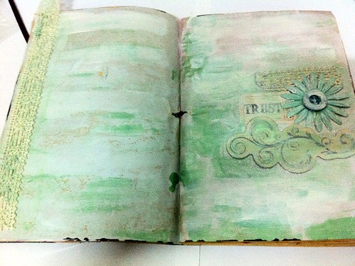
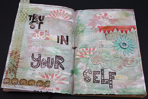
Yeap, its the second one. And I don't think it was a good attempt on this one. Lol! Feels a bit...duh! Dull..... Anyways, I told you that i'll be sharing with you whether if it worked out or not, did i not? Hehe...
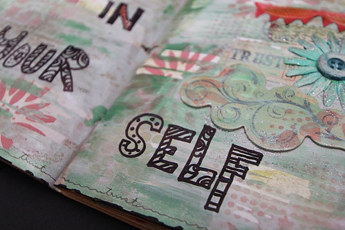
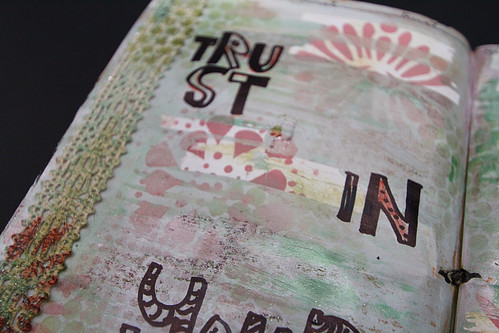
Here, I have used Balzer's Design stencil (TCW). I created layer and layers of inks/paints and stencils. Oh yess, and i have used correction tape here too. An idea sparked by an artsy friend from Such Pretty Canvas! Hehe...
A short post this time around. Gotta go and play with my son now cos' I think he's trying to get my attention by pulling away my iPad...lol!
See ya next time!


I LOVE your pages, doesn't matter what you think of them :). They are beautiful, calm, soothing, assuring pages. I love the many layers underneath the soft colors, and yes! I could see the correction tapes! Hehe. Love how you stamped on partially on the tapes too. This one is SAVED!.
ReplyDeleteHehe...thanks. Really stuck on this one in the beginning...
ReplyDeleteI'm agree with Shahrul, your page reflect quietness...I like that ! Thank to have participated to our challenge
ReplyDeleteCarol, one of the frappucinos
i don't see anything dull here! but a great makeover :)
ReplyDeletethanks for playing with us at art journal café
france
one of the frappuccinos
It's beautiful... love the lettering and how you spread it across the pages. Great layers all over. I got to take a class with Julie FF Balzer yesterday!
ReplyDelete